UNSPOKEN: A poster series that turns unspoken emotions into visual language
Timeline
3 WEEKS
Category
POSTER SERIES
Role
VISUAL DESIGNER
Tools
ADOBE creative suite

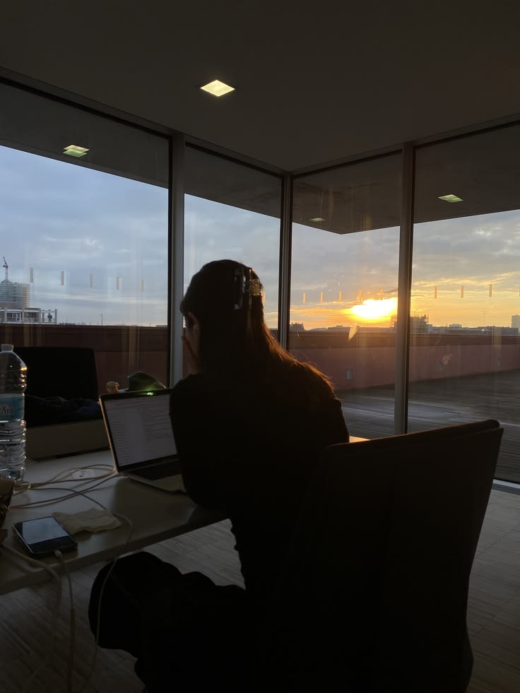
Finding meaning in the quiet moments we often overlook
Silence is often mistaken for emptiness, when in reality it's where awareness, understanding, and connection begin. Inspired by my own appreciation for quiet spaces, Unspoken is an awareness campaign that explores silence as a rich emotional space rather than an absence of sound.
Through tactile, handmade characters and expressive colour, the series invites viewers to experience what listening feels like, without saying a word.
Challenging the idea that silence means emptiness
This project began with a simple observation: people often associate quietness with passivity or absence. As someone who naturally finds meaning in listening more than speaking, I wanted to challenge that perception.
Rather than treating silence as something empty, I explored it as a space that holds reflection, empathy, strength, and connection. That personal perspective became the foundation for every creative decision that followed.


Creating space for those who often feel unheard
This campaign is designed for young professionals and students navigating environments where confidence is often measured by how much they speak. For those who feel unheard, overwhelmed, or pressured to be louder, Unspoken offers a different perspective, that quietness is not a weakness, but a way of connecting, understanding, and expressing ourselves with depth and authenticity.
Turning emotions into
a visual language
Instead of relying on words, I wanted each poster to communicate through form, colour, and composition.
The series follows five emotional themes: Presence, Empathy, Strength, Connection, and Signal, each representing a different way silence can exist between people. Together, they create a journey that moves from quiet awareness to emotional expression, allowing viewers to interpret the feelings through visuals rather than explanation.

Every colour carries an emotion
Colour became one of the primary storytelling tools throughout the series.
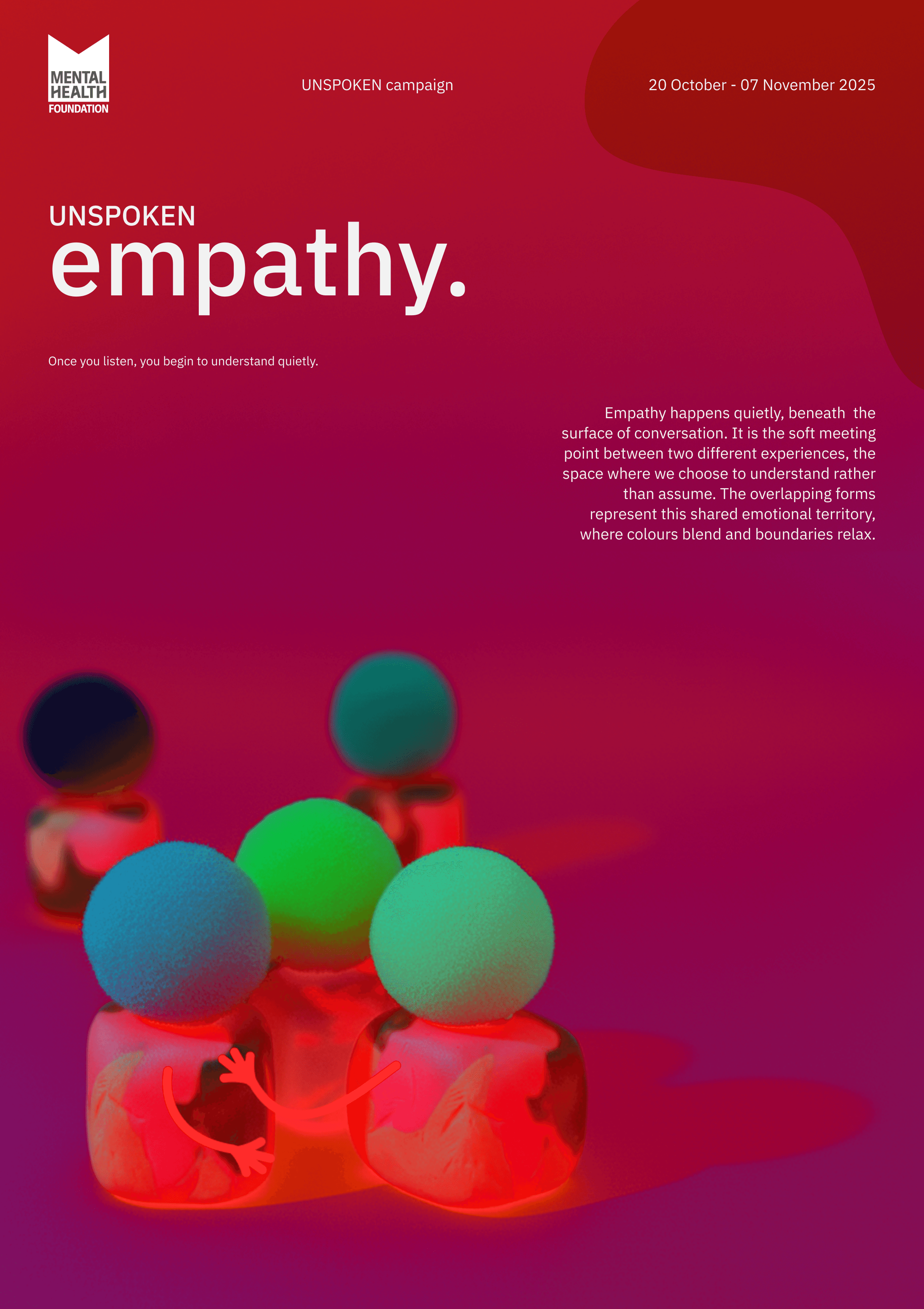
Rather than choosing a consistent palette, each poster adopts colours that reinforce its emotional theme. Grounding greens represent presence, warm reds and violets express empathy, deep blues communicate quiet strength, earthy yellows evoke human connection, and darker purples with rich reds capture moments when emotions become impossible to hide.
Soft gradients and glowing overlays add a dreamlike quality, suggesting emotions that exist beneath the surface—felt deeply, yet rarely spoken aloud.

presence.

empathy.

strength.

connection.

signal.
Building emotion through simple,
handmade forms
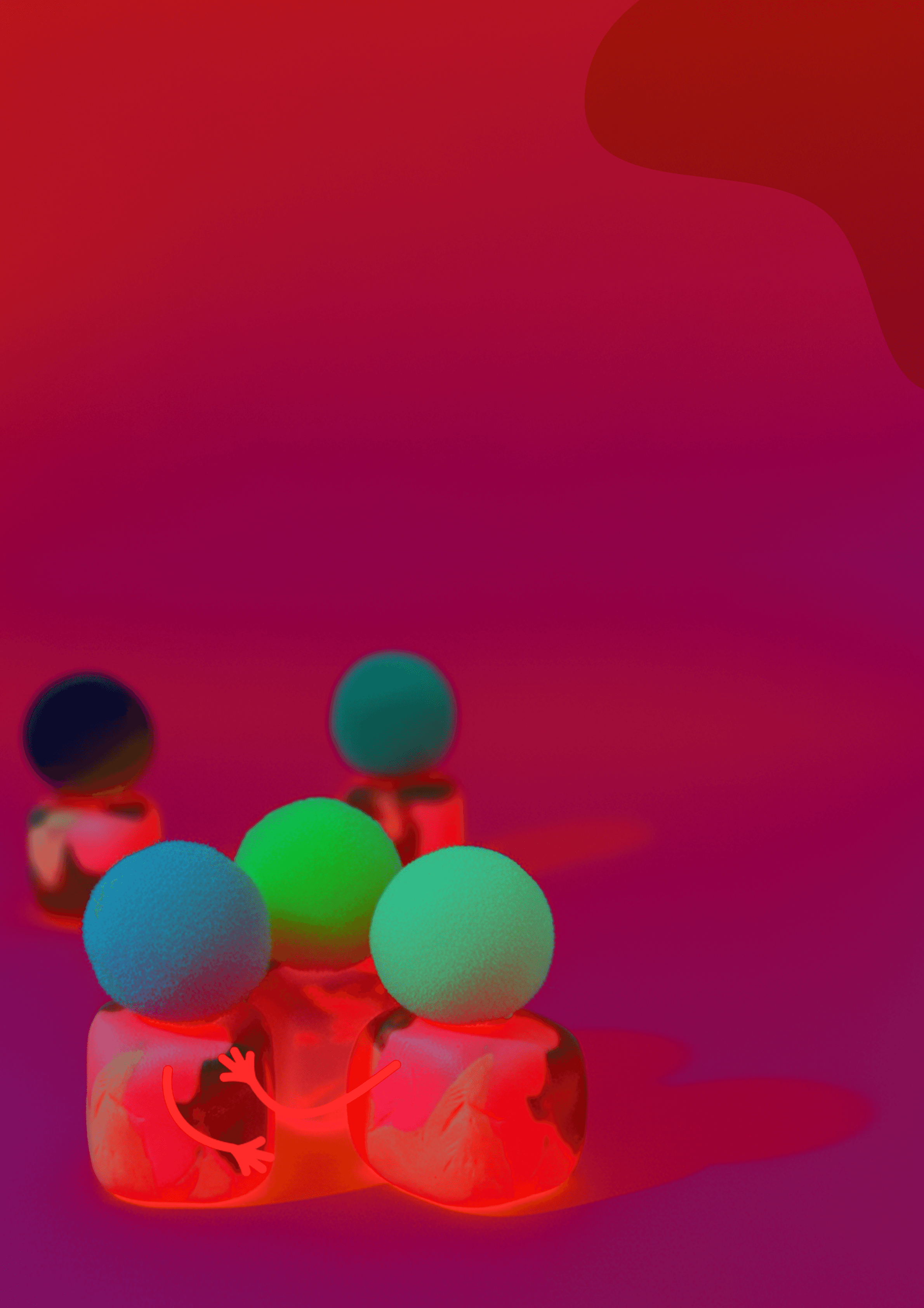
To keep the series approachable and human, every character was crafted using clay, colourful pom-pom heads, and simple illustrated arms.
Their imperfect, tactile appearance reflects the idea that emotions themselves are never perfectly polished. Rather than becoming decorative elements, the characters serve as emotional vessels, expressing feelings through posture, colour, and relationships instead of facial expressions or dialogue.


Giving silence room to breathe
Since silence is often described as "holding space," negative space became just as important as the elements placed within it.
Generous white space creates moments of pause between the characters, allowing each composition to feel calm, open, and reflective. Rather than filling every corner, the layouts intentionally leave space for interpretation, mirroring the quietness the campaign seeks to celebrate.
Typography follows the same philosophy. A clean, modern typeface paired with lowercase titles allows the imagery to take centre stage while maintaining a gentle, approachable tone throughout the series.



Creating a visual journey through five emotional states
Although each poster explores a different emotion, they were designed as one connected experience rather than five individual artworks.
Together, they remind viewers that silence can be comforting instead of awkward, expressive instead of empty, and deeply meaningful even without conversation. The campaign encourages young adults, particularly those who often feel unheard or pressured to be louder, to recognise that quietness also deserves to be seen and understood.