The Narrative - A Cultural and Entertainment Publication
Timeline
3 weeks
Category
Website
Role
Sole UI Designer
Tools
Figma, Figjam, Adobe Suite




Crafting a unique visual identity across diverse genres
Our content features music critiques, author interviews, gaming insights, and cultural events. With such a variety of genres, it’s easy to fall into a generic style. I explored multiple directions and concepts before settling on a visual language that feels both curated and adaptable.
The main inspiration came from the idea of drawing from real physical items. I looked at cassette tapes, VHS, vinyl records, CDs, radios, and game controllers—all of which share a commonality in their shapes. Most of them have a rectangular form with a circle inside.
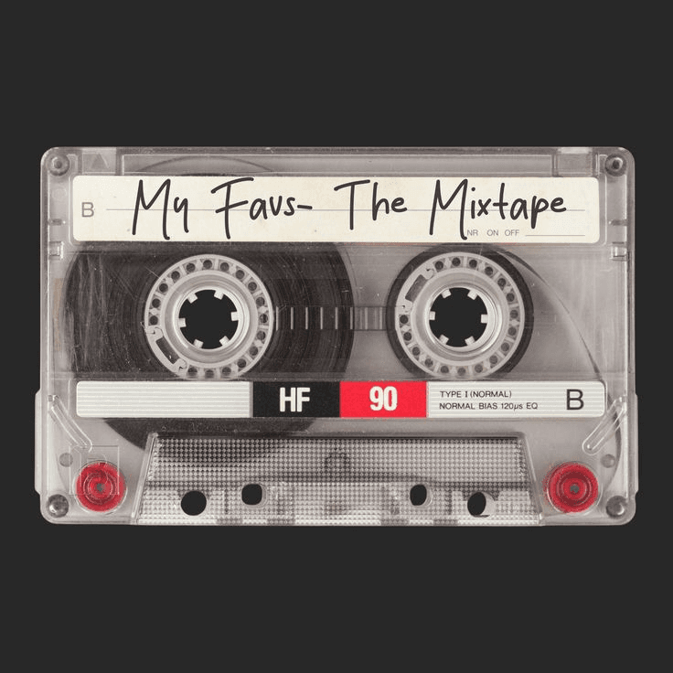
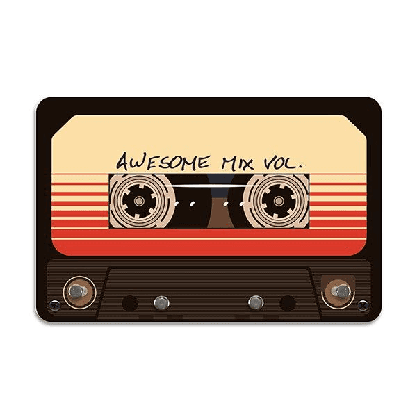
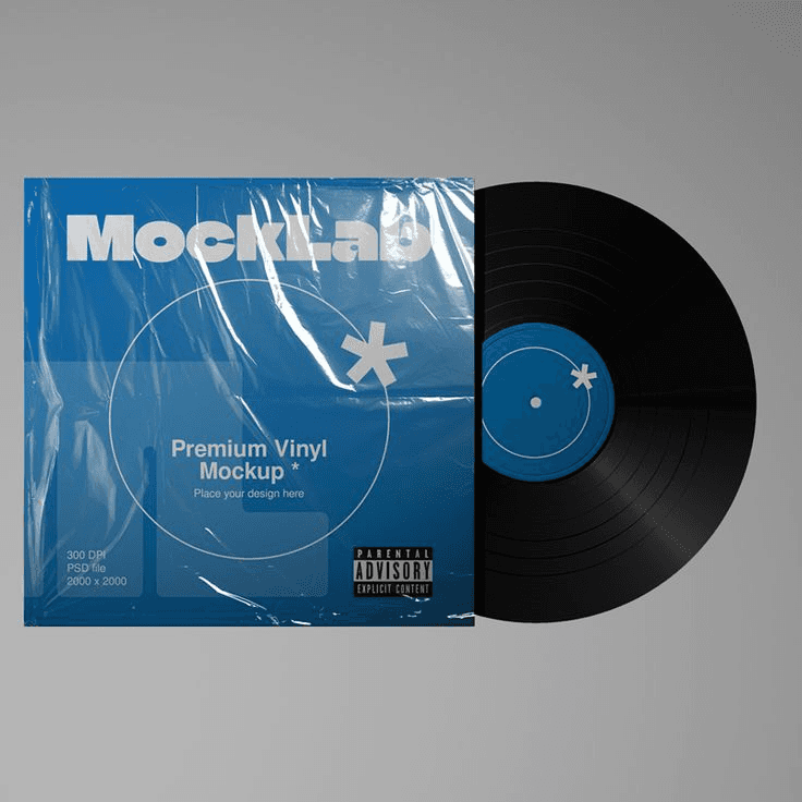
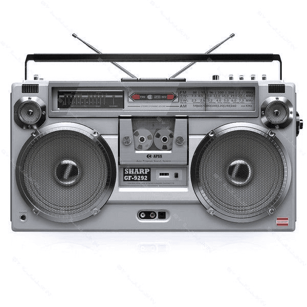
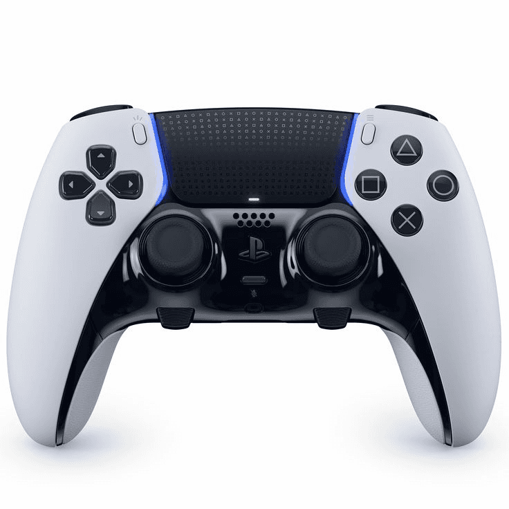
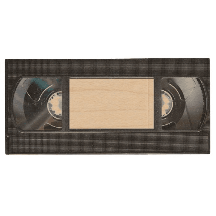
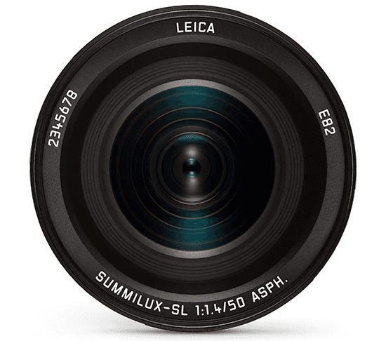

Turning shape into identity
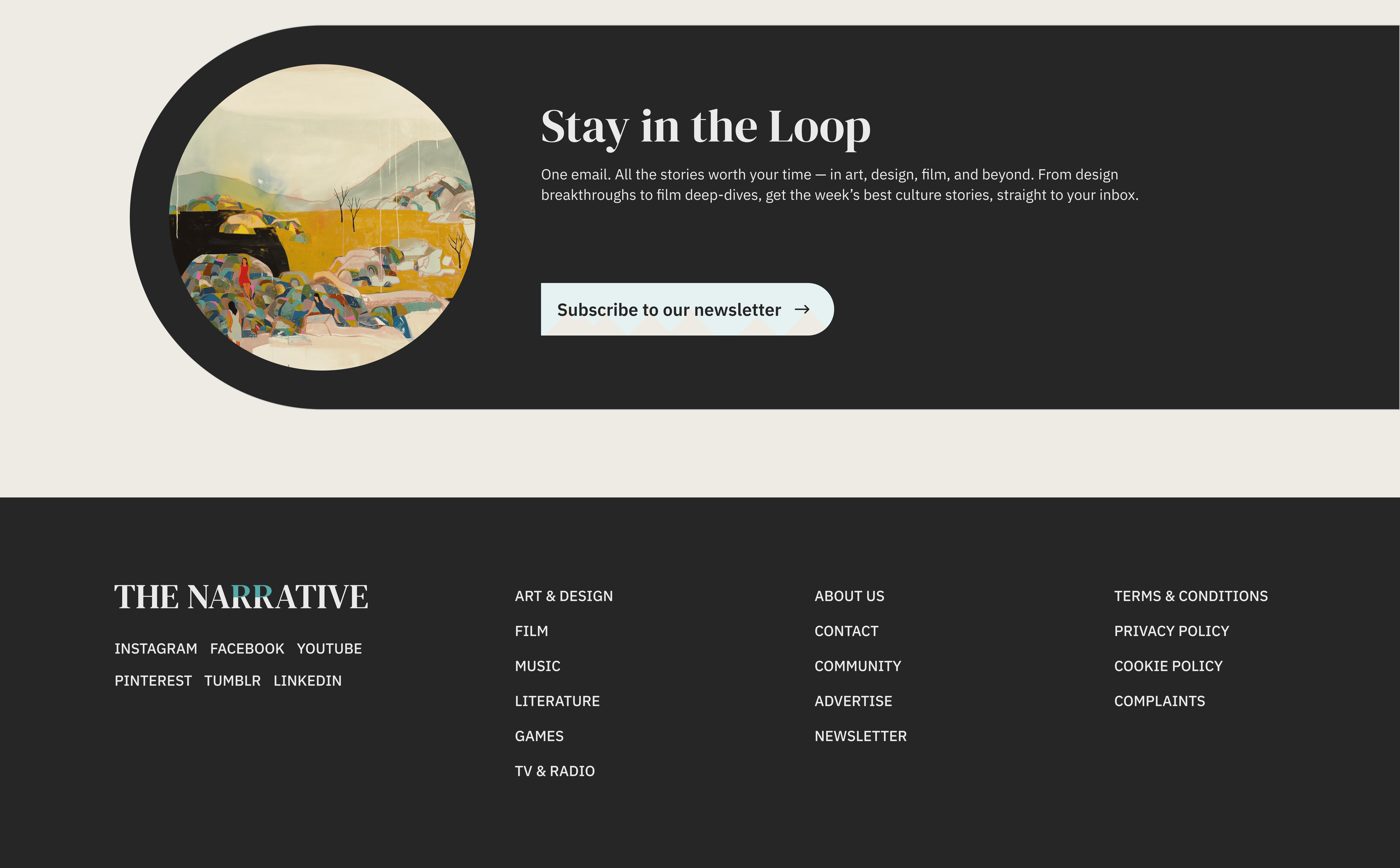
This inspired me to create the logo for 'The Narrative,' incorporating that shape into the letter 'R.' I also designed some UI components using the same visual metaphor, like the long read feature on the homepage, the audio player, tags, and the newsletter subscription section.
Listen to this article
0:19/8:35
GAMES
NEWS
FEATURED
Blending classic elegance and modern clarity in typeface selection
Given the cultural focus of this publication, I chose the DM Serif typeface to embody that spirit, using Display for the headings and Text for the smaller titles. At the same time, to achieve a modern, clean, and versatile look while enhancing readability, I opted for IBM Plex Sans for all body text.
Heading 1
[Regular - 64/72]
Heading 2
[Regular - 48/60]
Heading 3
[Regular - 32/40]
Body
[Regular - 20/28]
Tagline
[Regular - 16/18]
Heading 1
Body
Tagline
NEWS
20 mins ago
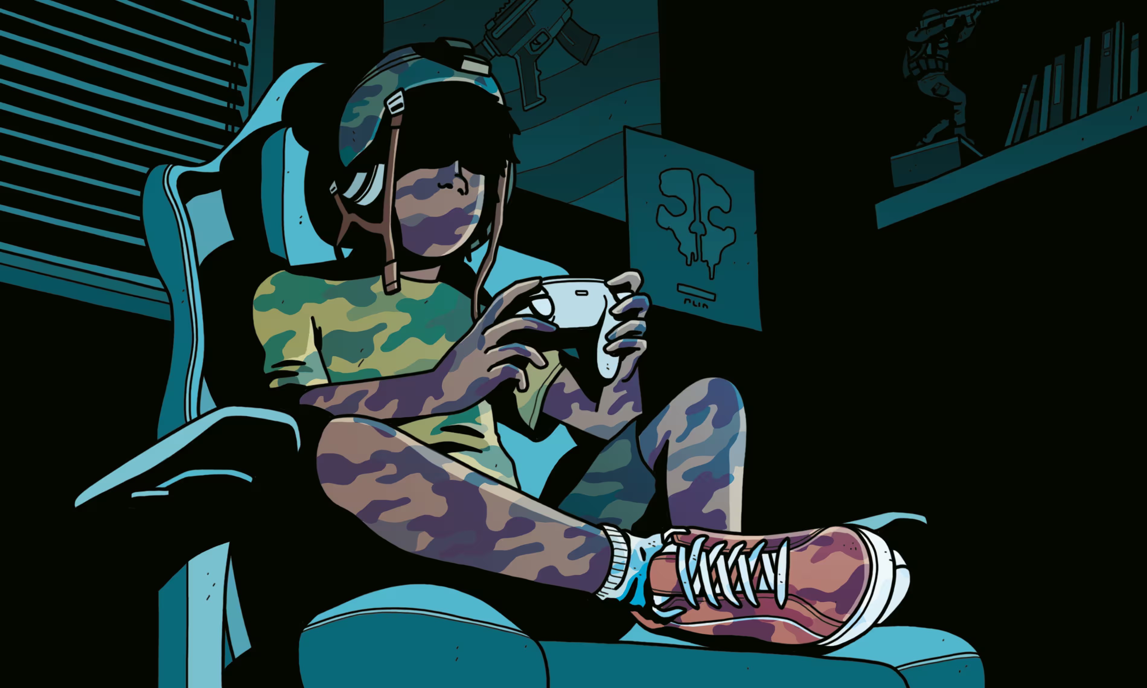
The US military is embedded in the gaming world. Its target: teen recruits
In a small room tucked into a US navy facility outside Memphis, Tennessee, uniformed personnel sit hunched over monitors, their eyes focused on screens as they speak into headsets with clipped efficiency. Computer towers and glowing red keyboards crowd their desks. This is top-of-the-line gear, used for executing combat missions and coordinating strategy – but not with fleets stationed across the world. These sailors are playing video games. On the other end of their headsets and screens are young gamers they hope to inspire.
“In 2019, we did a big look at where we were spending our money, looking at where the next generation is,” says Lt Aaron Jones, captain of the navy’s esports team, as we sit in his office after touring the facility. A naval press officer hovers a few feet away. “This is where they are,” Jones continues. “Whether it’s Twitch or YouTube or Facebook Gaming, this is what they love.”
Using predominantly black and white with a warm touch
The main color is a warm black, #262626, which isn’t quite pure black; it has delicate brownish-gray undertones that lend a softer, more literary vibe. The background color, #EEEBE5, is a gentle off-white with a warm tint, creating a welcoming atmosphere. We use the accent color #007474, a rich deep teal, sparingly for tags, highlights, and interactive elements.
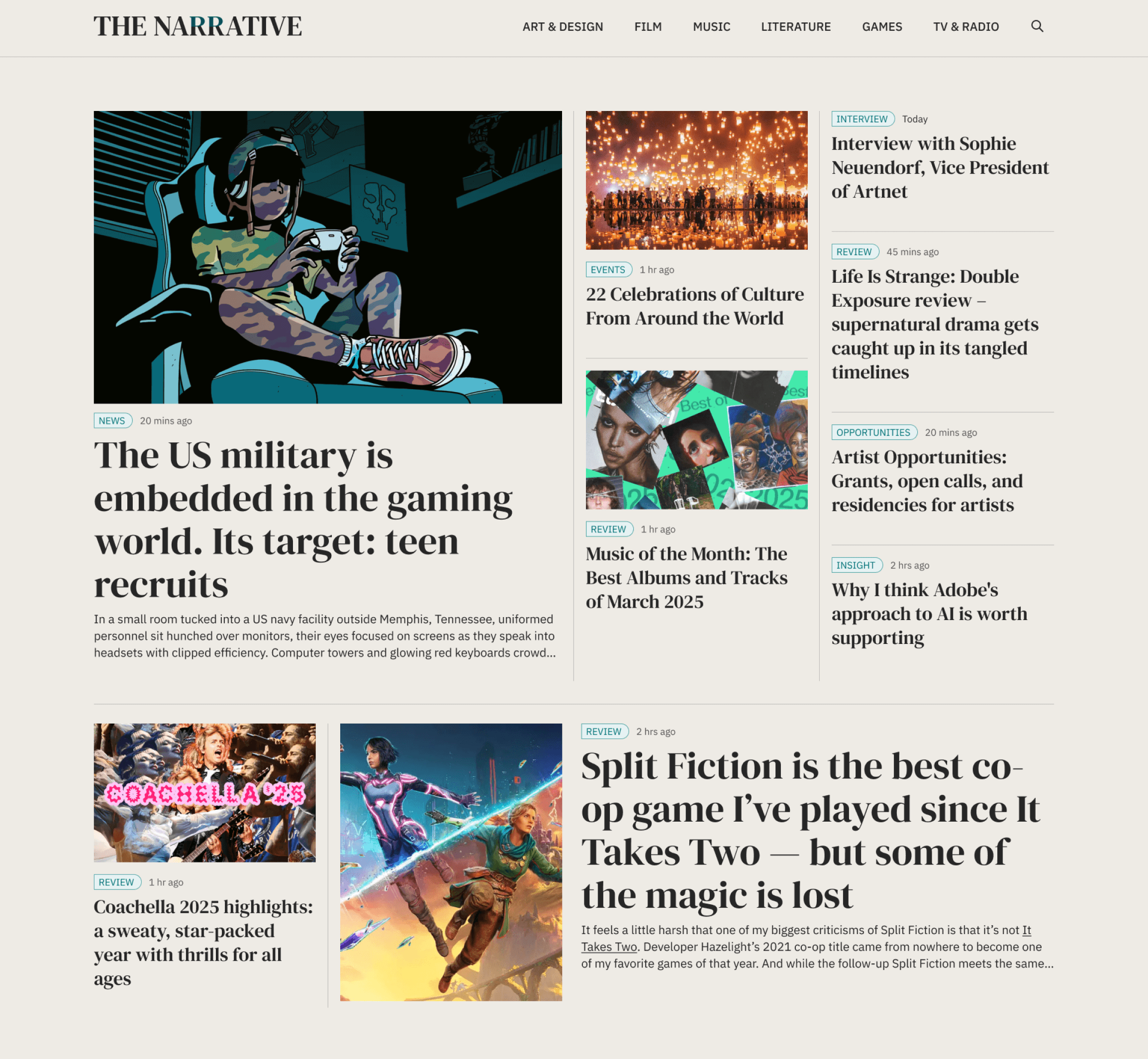
Homepage, designed like a newsstand
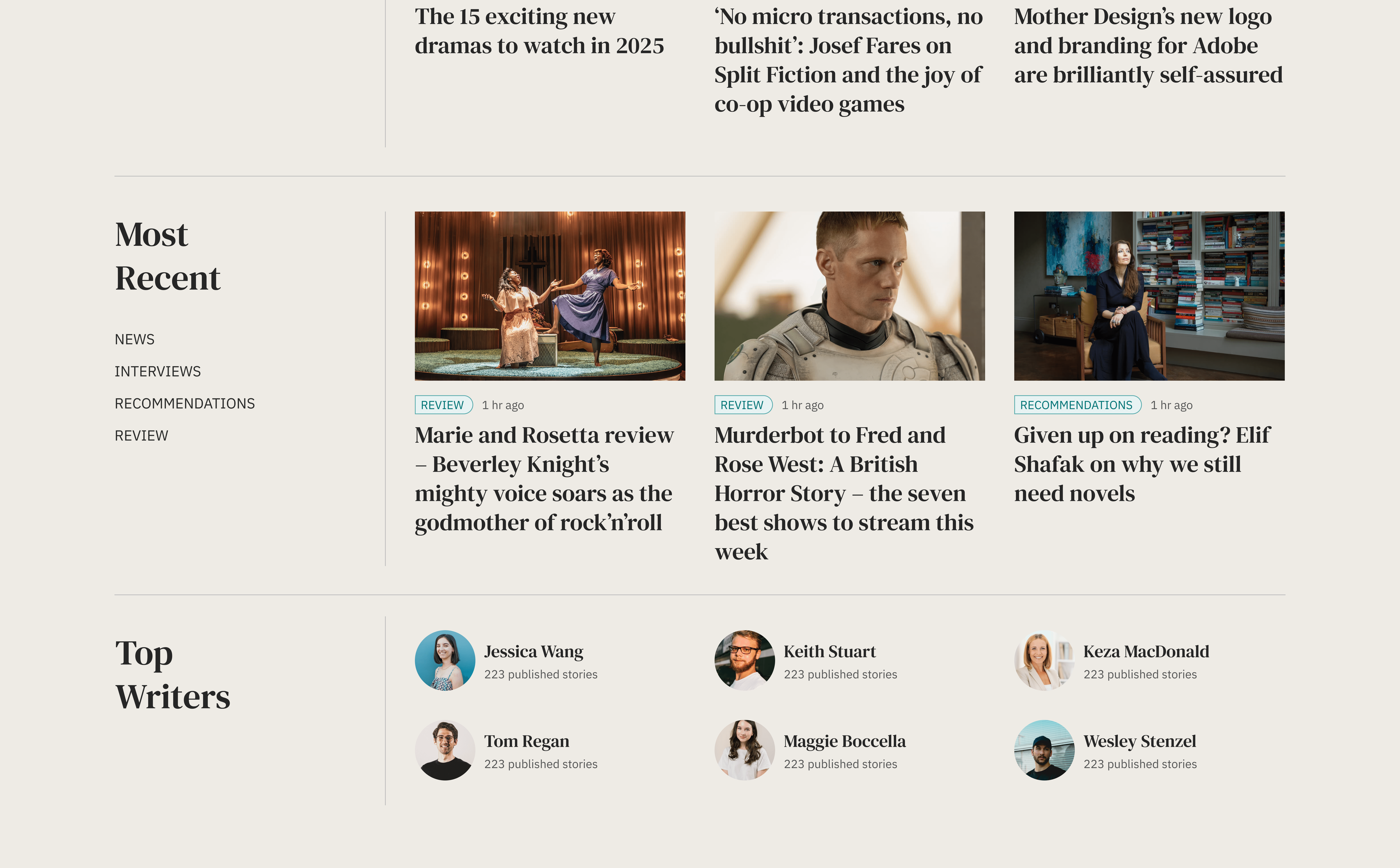
The homepage showcases our latest and greatest content, every day, we feature 7-9 stories, each with its own unique card design, while maintaining a cohesive structure that ensures everything feels organised and accessible for our readers.
REVIEW
1 hr ago
Music of the Month: The Best Albums and Tracks of March 2025
Long reads and newsletter, visually tied together by shape
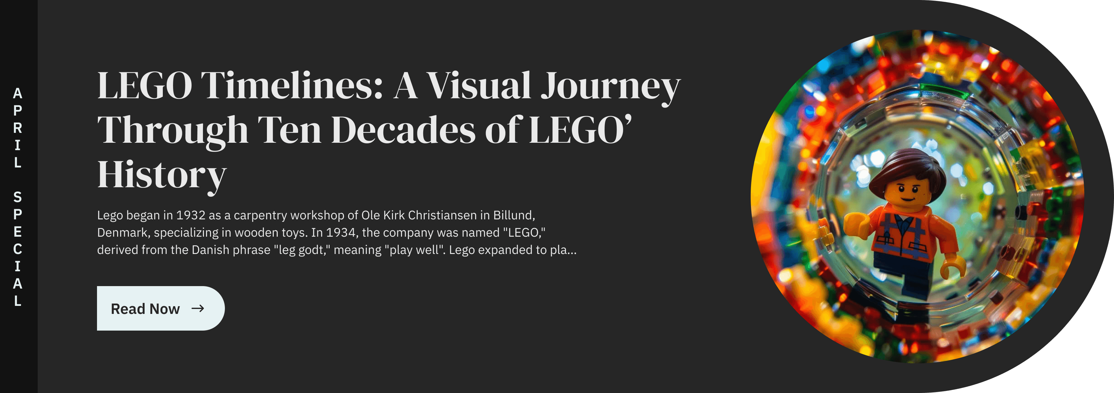
Next, we highlight our long read of the month, sticking to the same visual theme I mentioned earlier, with a circle/square motif. The newsletter section also follows the same circle/square design, but this time in the opposite direction, to balance the overall look.
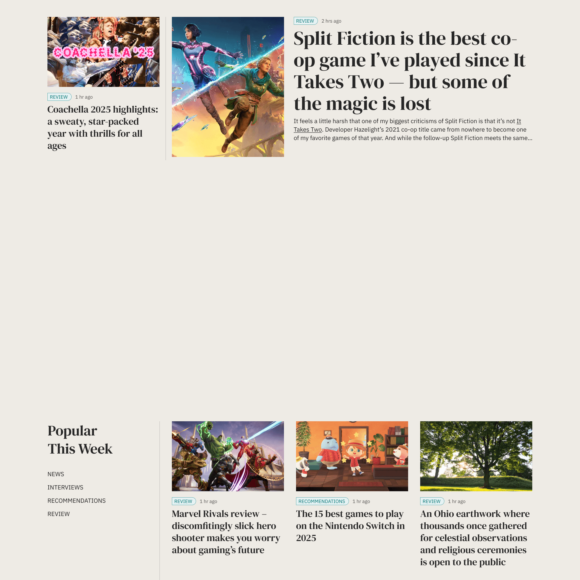
Layout designed for visual clarity and content hierarchy
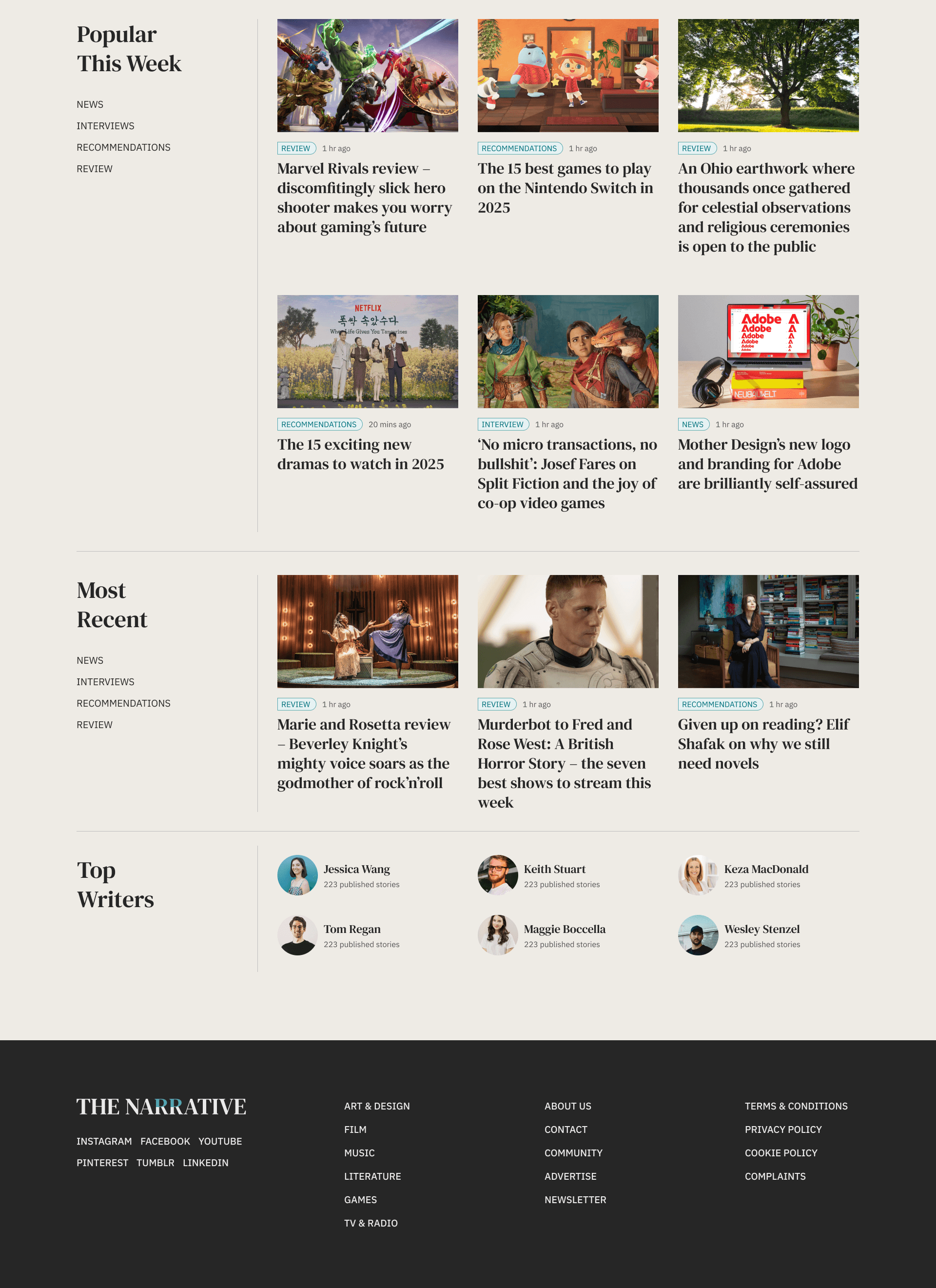
As you scroll down, you’ll find neatly organised sections for this week’s trending stories and the latest updates, both equipped with filters in the left column for better space management and easier navigation to specific content. We also have a dedicated area for our top writers, all designed with ample white space and a minimalist touch.
This layout prioritises clarity, ensuring that both text and images are beautifully arranged. The footer keeps with the minimalist theme, featuring simple navigation that reflects our commitment to delivering quality content in a seamless, user-friendly experience.
NEWS
1 hr ago
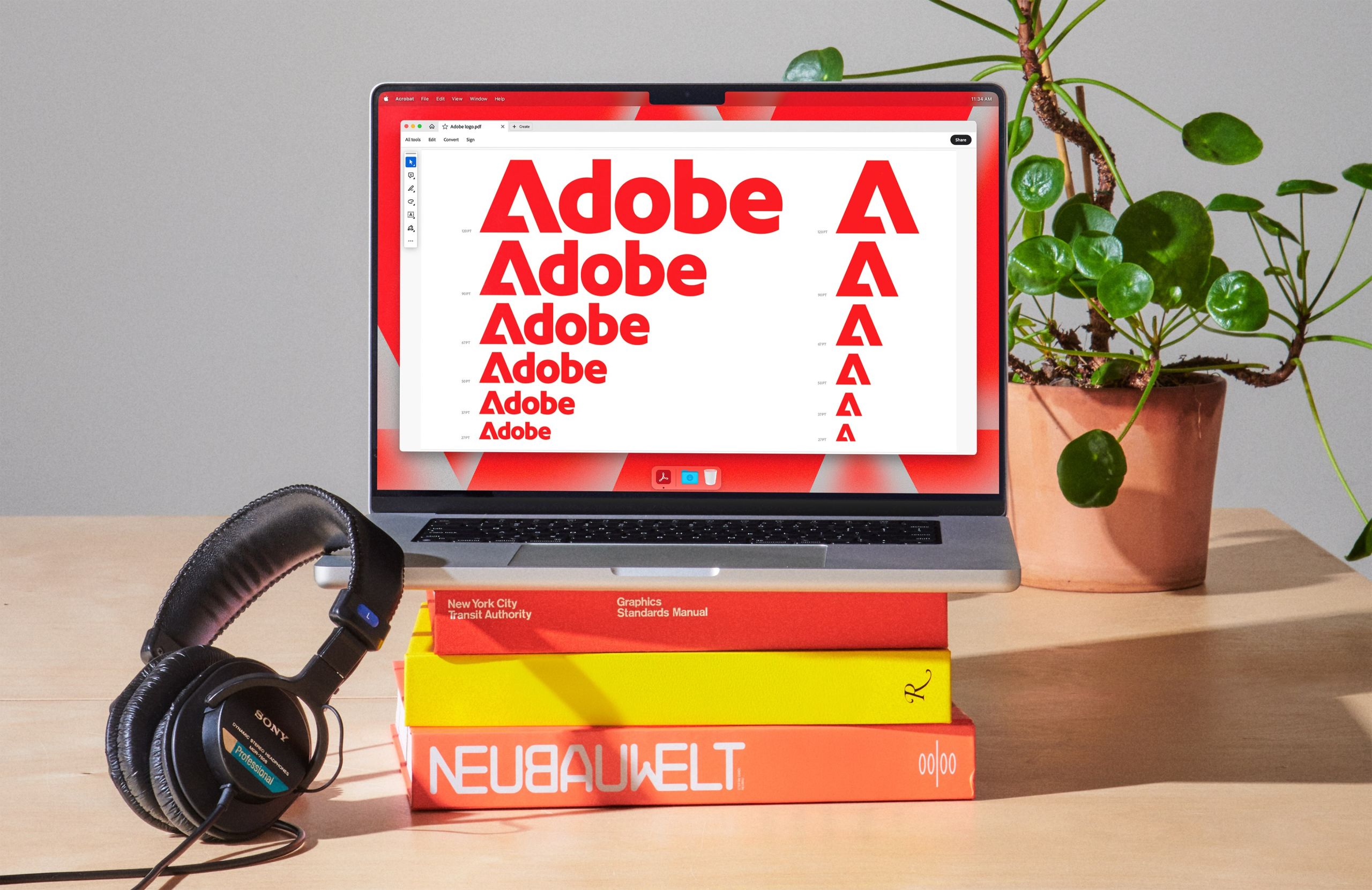
Mother Design’s new logo and branding for Adobe are brilliantly self-assured
Designing a flexible story template that adapts to any content
I designed the template page for our daily stories to ensure everything stays organised, no matter if the text is lengthy or brief, if the images are landscape or portrait, or if there’s a quote or an image gallery. Everything is easily interchangeable, keeping the overall look and feel consistent.
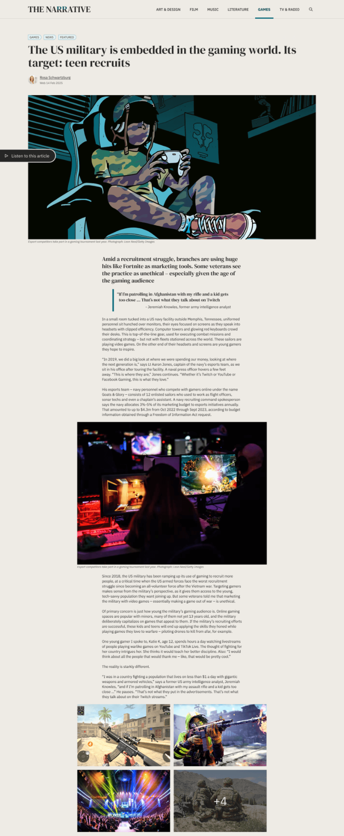
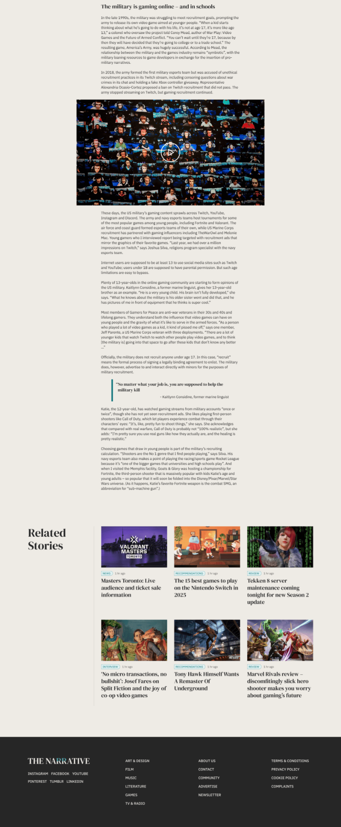
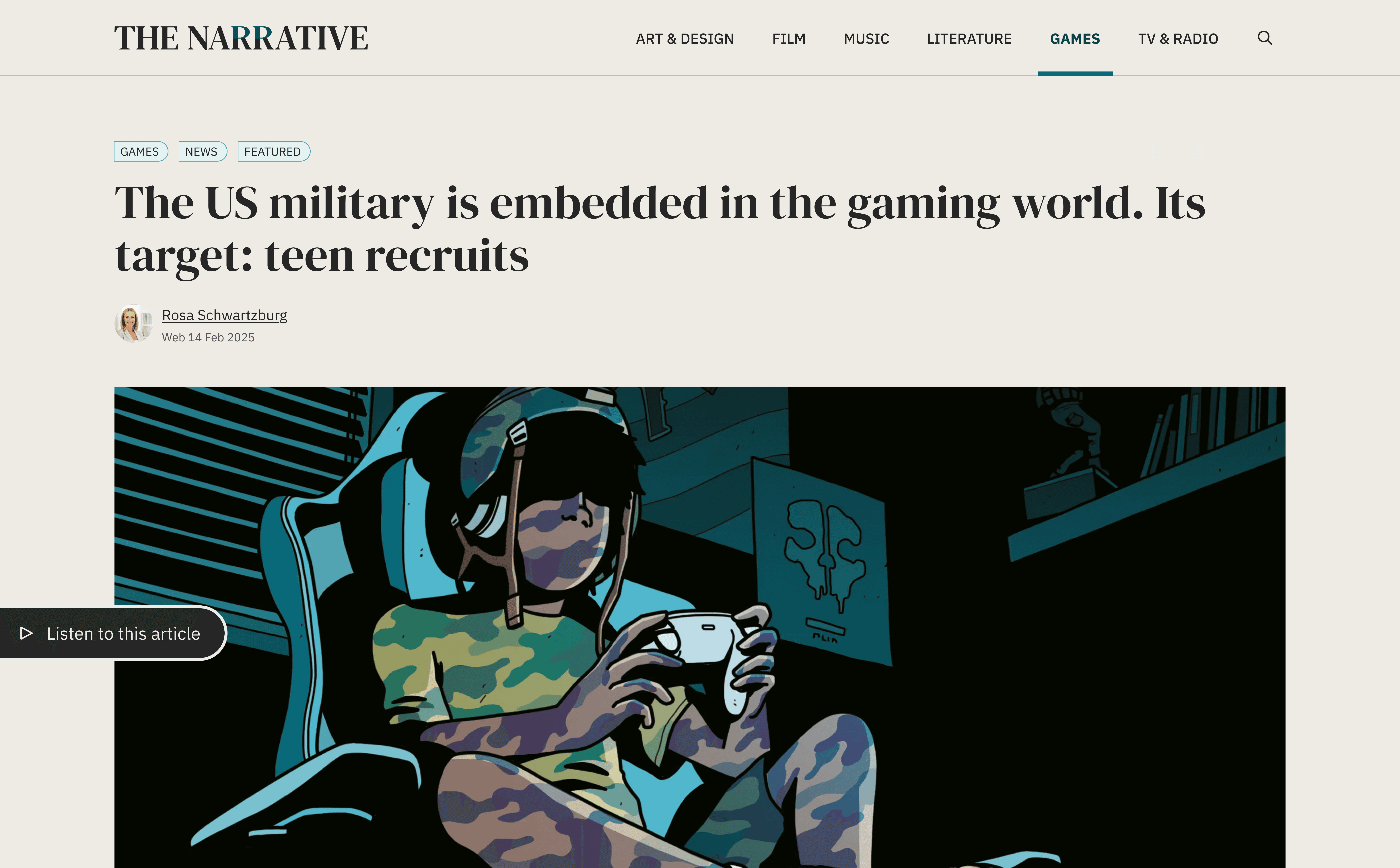
Starting with context — tags, title, author, and hero image
The template starts with a compact hero section that gives users immediate context. Tags are placed at the top to indicate the category of the story — whether it's music, film, literature, or design — followed by the H1 title, author name, and publication date. A large hero image sits just below this metadata. I intentionally designed it this way so users can quickly scan what the story is about and who wrote it, without needing to scroll. The image layout is flexible — instead of stacking it rigidly above or below the text, it flows naturally with the content, ensuring the overall layout looks balanced no matter the image size or orientation.
Optional audio that plays seamlessly while reading
Some stories come with an audio version. If available, the player appears right after the hero section. To enhance the experience, the full audio controls are visible initially, but as the user starts scrolling, only the play/pause button remains in view. This allows users to listen while reading, keeping the story front and center without any visual distractions.
Listen to this article
0:19/8:35
Leading with a bold intro and a flexible quote component
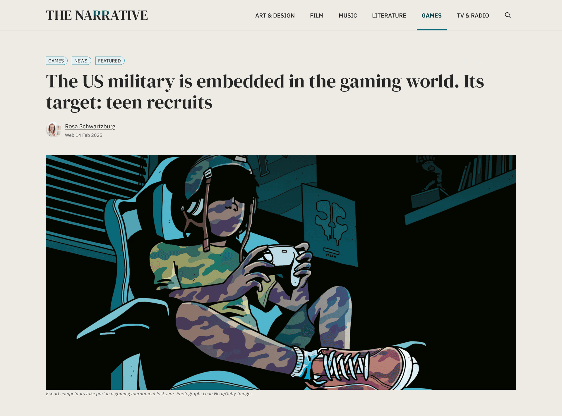
Every story opens with a brief intro paragraph styled as an H2—large enough to catch attention and set the tone before diving into the full piece. This intro serves as a sub-headline, giving users a quick glimpse of what the story entails. Additionally, there’s a quote component that can fit in anywhere—right after the intro, following an image, or nestled between body paragraphs. No matter its placement, the quote layout maintains a clean visual rhythm, ensuring it doesn’t overshadow or disrupt the story flow.
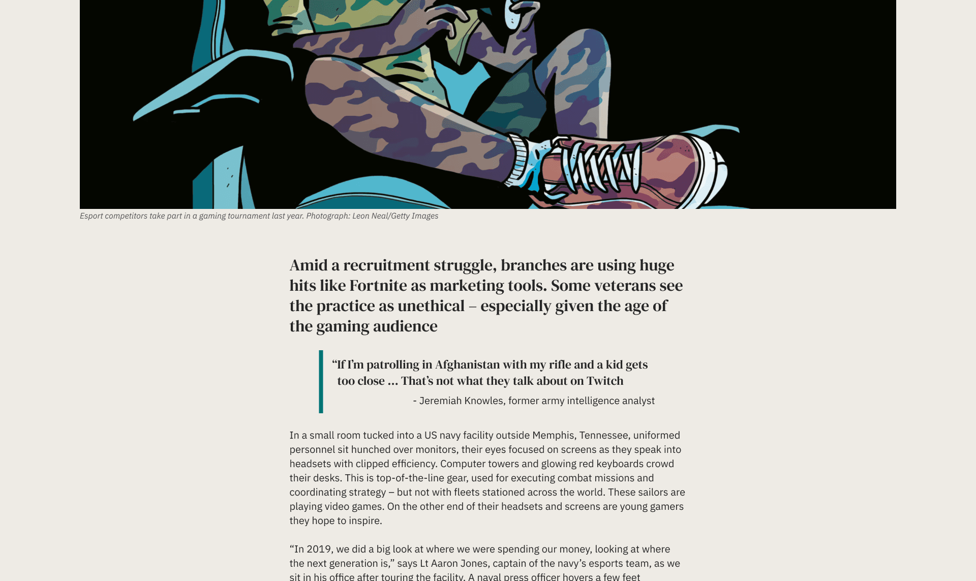
Image handling that adapts to any layout or format
All images within the story are designed to automatically fill the page's width, no matter their height or aspect ratio. This approach keeps the layout clean and consistent. When multiple images are present, they’re displayed as a scrollable gallery—an intuitive way to integrate visuals without interrupting the reading flow or creating awkward gaps.
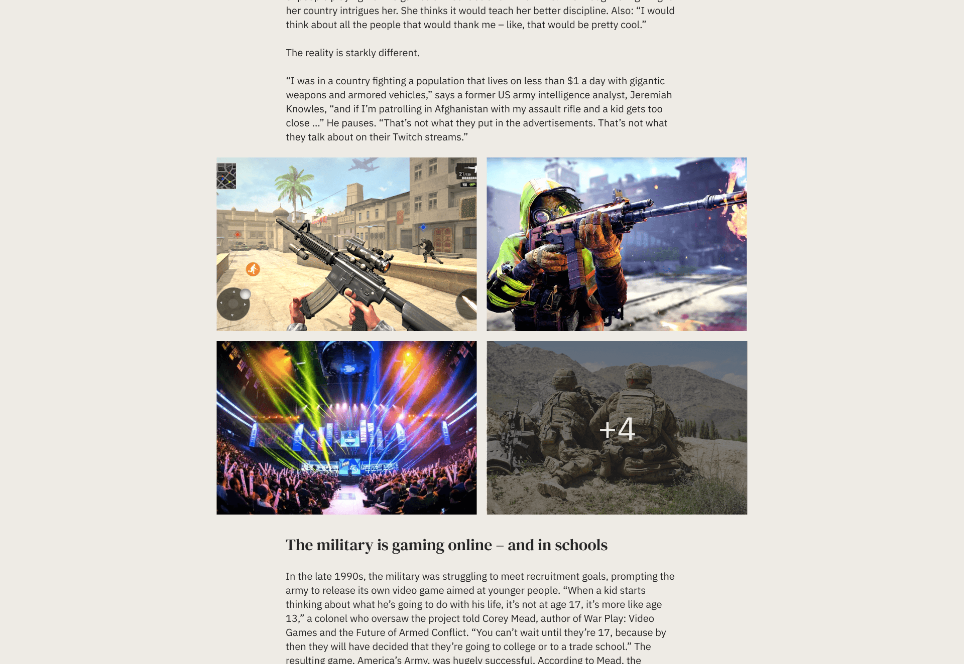
Custom video player that matches the site’s look and feel
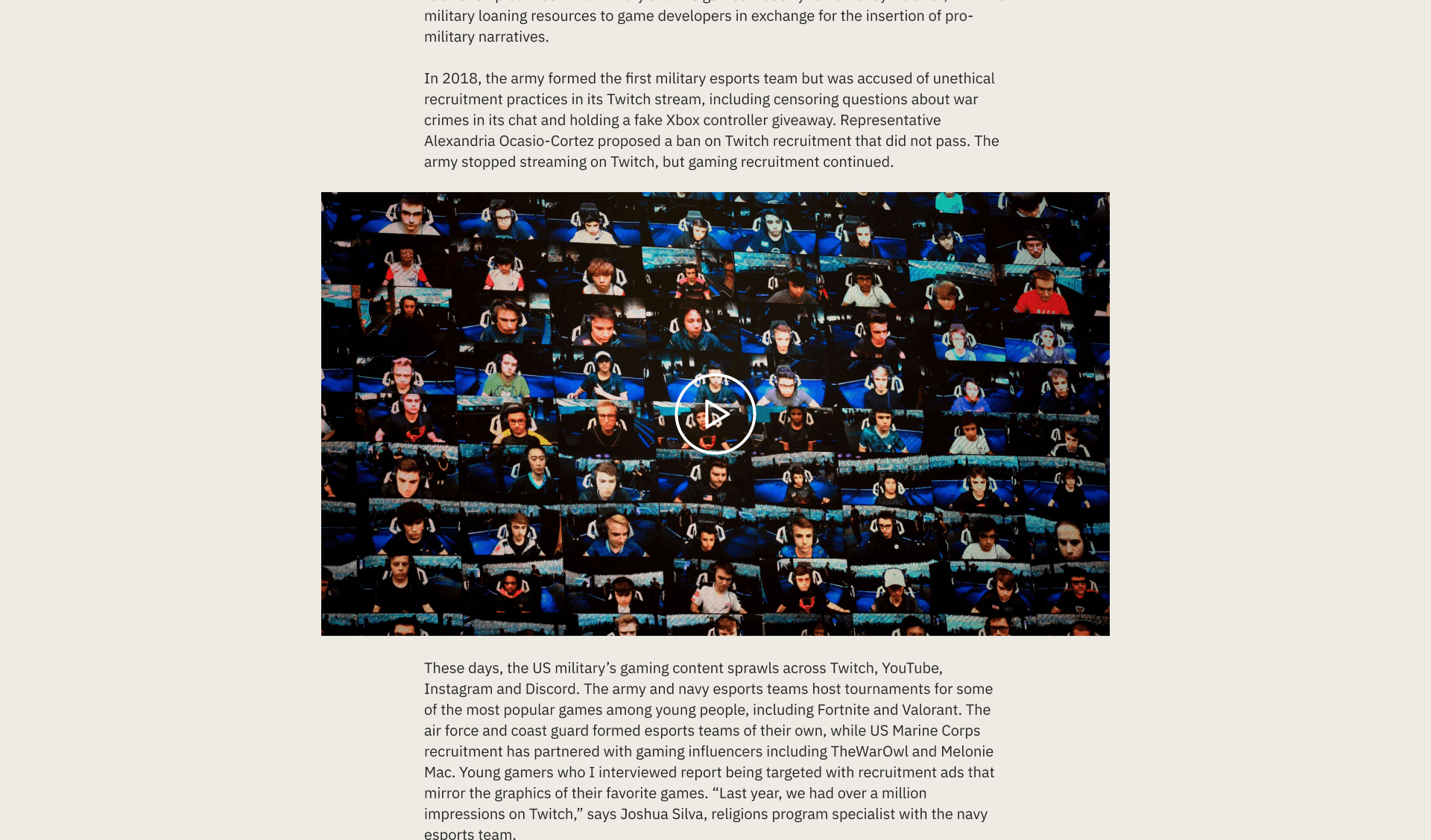
When a story features video, we embed a standard YouTube player—but with a twist. Instead of the default YouTube interface, I crafted a custom play button and thumbnail overlay that aligns with the site's overall aesthetic. This approach keeps the experience visually cohesive and avoids jarring UI shifts between content types. The player only reveals the YouTube controls once the video starts, ensuring a neat and polished appearance on initial load.
Ending with related stories in a familiar, clickable format
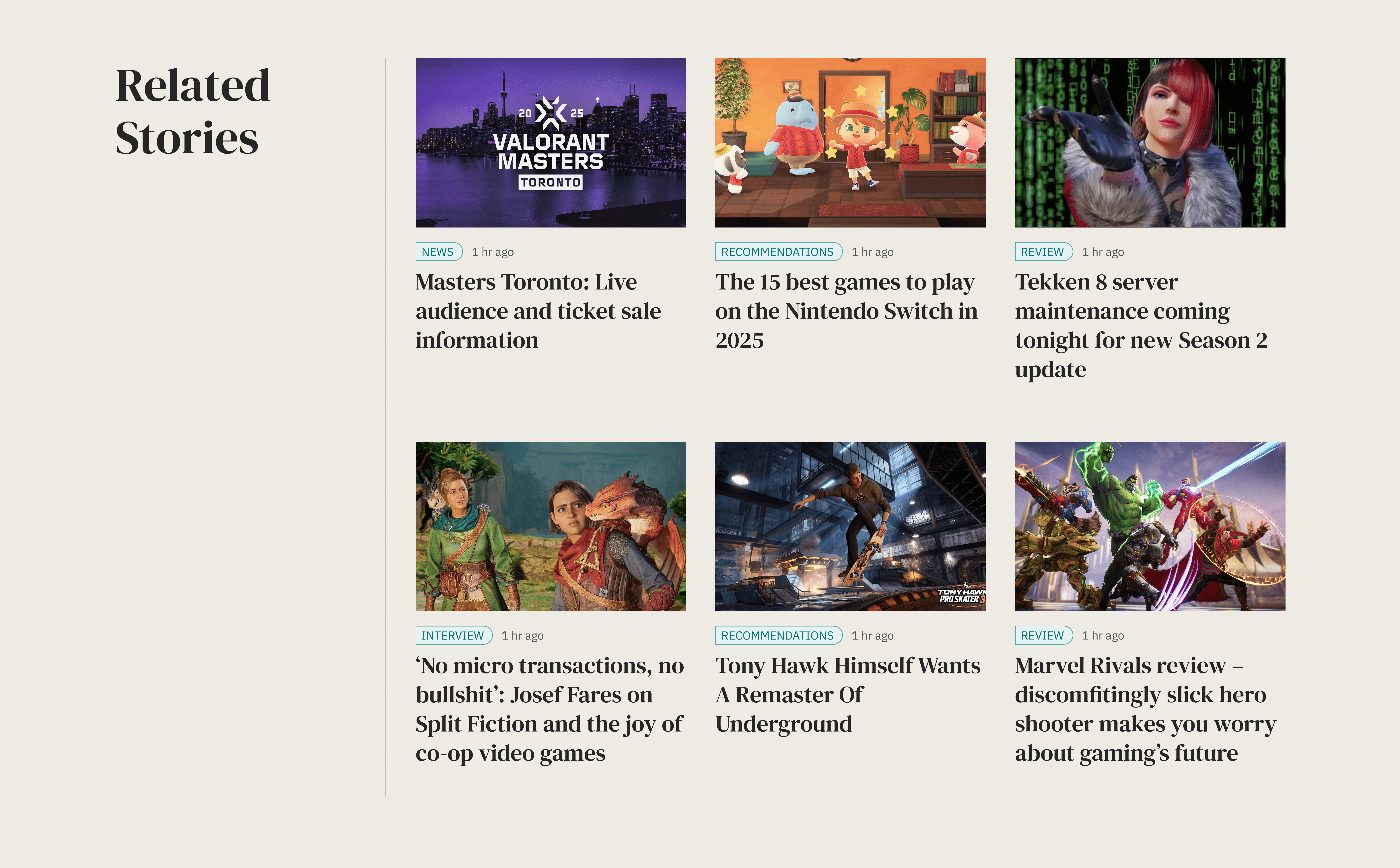
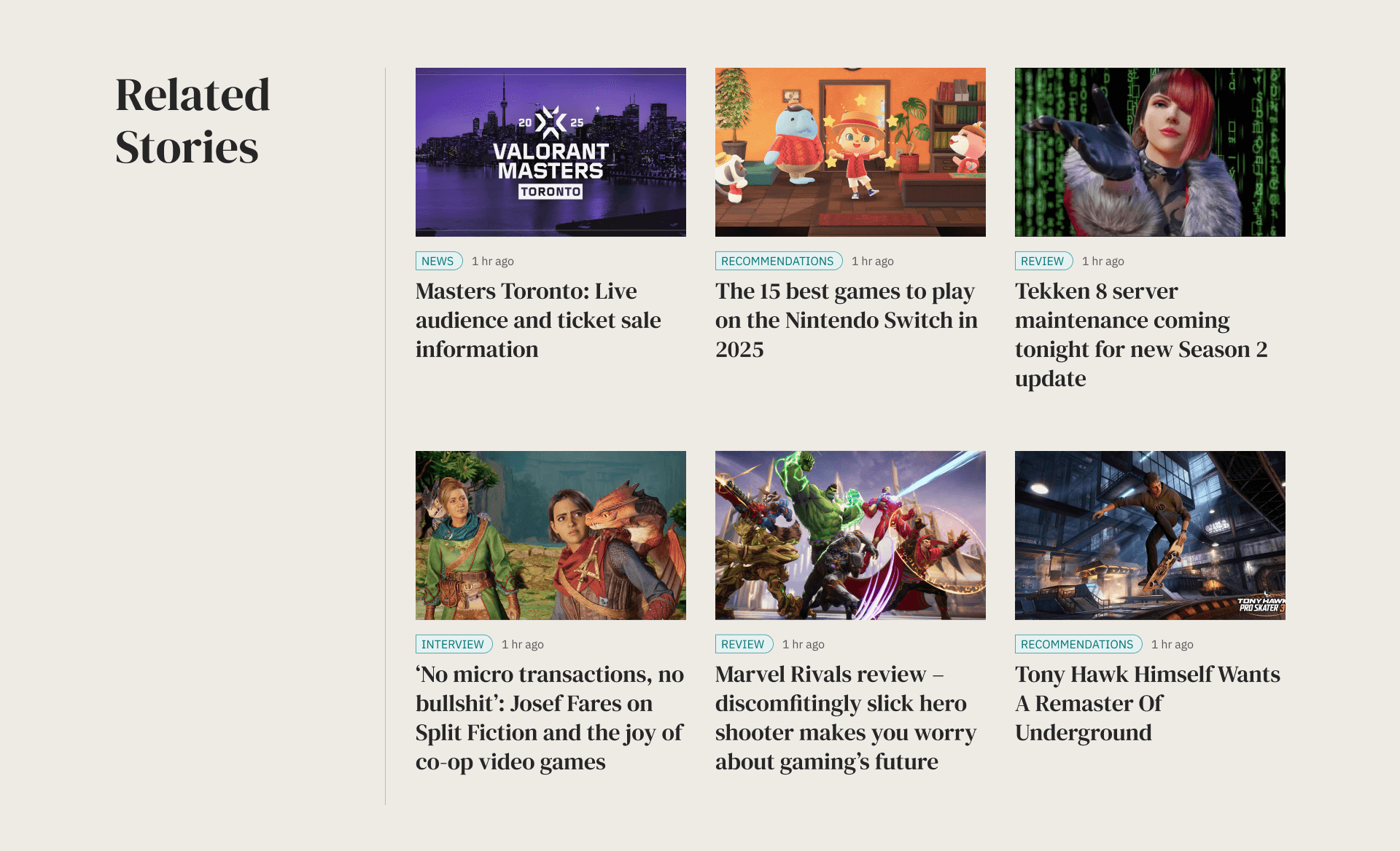
At the conclusion of each story, readers encounter a “Related Stories” section, presented in the same grid layout as the homepage. This design choice helps maintain visual consistency and encourages deeper exploration. Whether someone has just finished a lengthy article or a brief daily story, this section serves as a natural segue to more content that aligns with their interests—without disrupting the overall flow.
RECOMMENDATION
1 hr ago
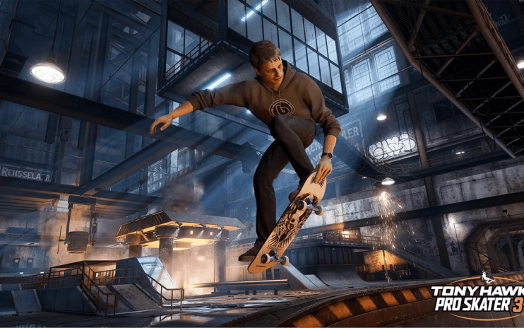
Tony Hawk Himself Wants A Remaster Of Underground
How the design balances personality, function, and flexibility
The final design effectively combines simplicity and cultural inspiration, using a circle within a rectangle to create a unique logo. The choice of classic serif fonts for headlines alongside modern sans-serif for body text enhances readability and adaptability. The warm color palette and generous spacing contribute to a curated feel, making the site resemble a well-structured publication rather than a typical content platform.