KoYanTaw - A personal safety companion for Burmese commuters
Timeline
9 months
Category
application
Role
UX & UI Designer
Tools
Figma, Figjam

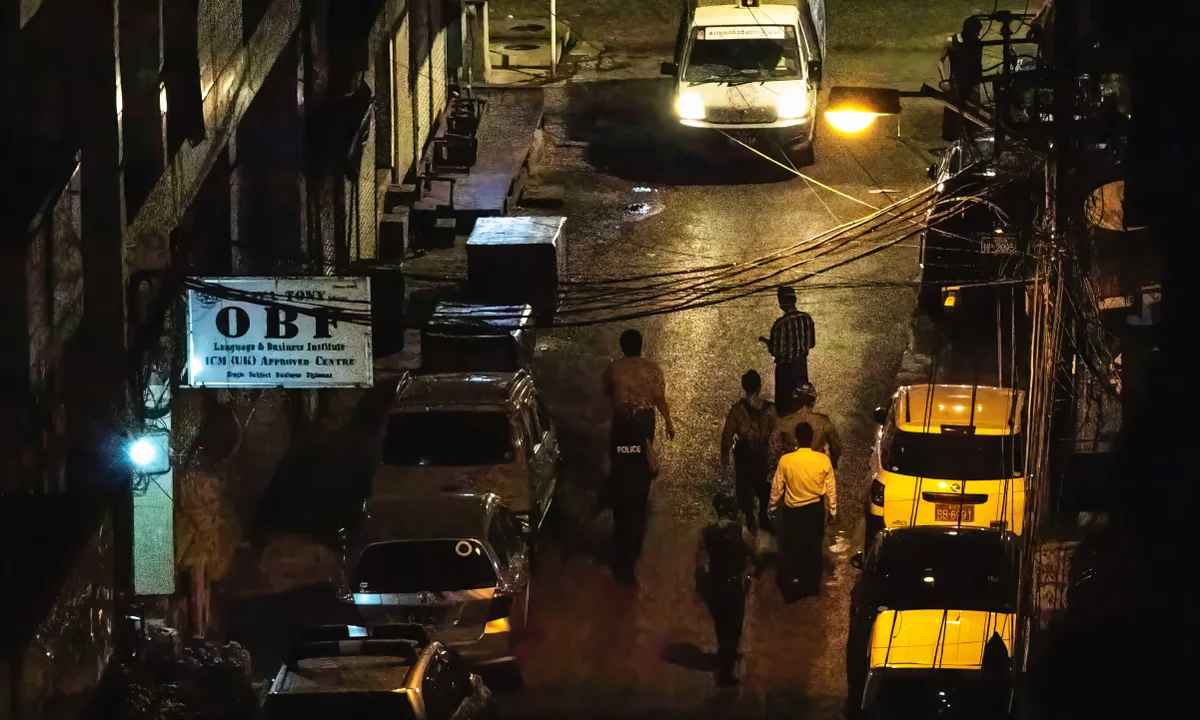
Creating an accessible safety app for daily and late-night commuters
KoYanTaw, meaning "safeguard" in Burmese, is a community-driven safety app designed for late-night workers, daily commuters, and individuals concerned about the safety of their loved ones. Built under a nonprofit, open-source model, the app provides core safety features such as location sharing, a "WatchMeOver" mode, and a panic alert system. Our team comprised 2 UI/UX designers (including myself), 3 developers, and a project manager.
Making personal safety simple, fast, and reliable
Our goal was to develop an intuitive personal safety app that empowers users with reliable features for location sharing and emergency alerts, enhancing their sense of security and confidence in everyday commuting.


Using a human-centered approach to guide every decision
We followed the Design Thinking methodology throughout the project, beginning with empathizing with users to ensure the app addressed their real-world needs. This human-centered approach guided us through research, ideation, prototyping, and testing, allowing us to create a product that balanced user desires with functional safety features. By maintaining a focus on iterative improvement, we ensured that the KoYanTaw app evolved in response to user feedback and technological considerations.
Learning how people actually stay safe in daily life
We conducted guerrilla research with five target users to understand their pain points and needs regarding safety while commuting. Key insights included:
Diverse Location-Sharing Habits: Users relied on multiple apps (Grab, Life 360) with varying frequencies.
Technology Familiarity: Users showed a range of comfort levels with location-sharing technologies.
Effort Perception: Many perceived location-sharing as additional work, indicating the need for a simplified UI.
Safety Preferences: Users employed a variety of methods (calls, texts) to share their locations.
After gathering these insights, we conducted market research to further expand our understanding of the competitive landscape. We performed a competitive analysis on both direct competitors like Google’s Safety, Noonlight, and indirect ones such as Grab and Google Maps to identify similarities and differences in their feature sets.

Competitive Analysis of Direct Competitors: Safety, Trackview, Life360, Noonlight and Tracky
Users rely on workarounds rather than dedicated safety tools
After gathering insights from our research, we defined the problem as follows:
"
Commuters, particularly late-night workers, need a reliable and easy-to-use safety tool that allows them to share their location and send emergency alerts without requiring complex interactions or extensive effort. Existing solutions are either too complicated or lack the flexibility to adapt to individual safety preferences.
This led to the key question:
?
How might we create an intuitive, flexible, and low-effort safety app for commuters that enhances personal safety without overwhelming users with complex interactions?
We created user personas, information architecture (IA), user stories, and user flows based on these user stories to guide the app's structure and functionality. Additionally, we set up a Jira board to track tasks, ensuring organized development and progress tracking.
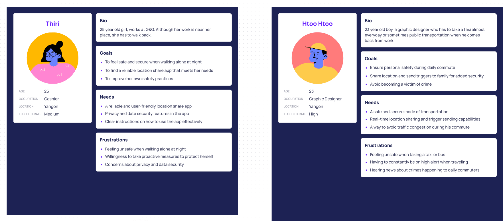
User personas: Thiri & Htoo Htoo

User journeys for four scenarios

Information Architecture of the whole app

user stories

One of eight the user flows
Discussions with the team led to the inclusion of three MVP features:
Login
WatchMeOver Mode: Allows users to share their location with a chosen contact.
Panic Mode: A feature where users hold a prominent button to trigger emergency alerts if they fail to confirm their safety.
Ideation & Solution Exploration
We brainstormed various solutions, weighing the pros and cons of using bus line data versus user-created custom routes. While bus lines offered ease of use, custom routes provided more flexibility, and we ultimately chose the latter.

Solution brainstorming document: Pros and Cons for route feature

2 of 7 idea sketches for Home screen
Design & Prototype
We moved through moodboarding and brand color selection (choosing black and yellow to symbolise taxis/buses). Then worked on creating low-fidelity sketches, mid-fidelity designs, which were refined into high-fidelity prototypes following feedback from the team. The design system was customised to align with our brand identity.

Mid-fi for Panic mode flow

Hi-fi for WatchMeOver mode happy flow
Usability Testing
We conducted usability testing to assess the core features of our MVP: WatchMeOver Mode and Panic Mode. Our target participants were late-night workers and daily commuters, with varying levels of tech familiarity. The primary goal was to evaluate ease of use, task completion, and user satisfaction.

Intro part from our UT plan document
WatchMeOver mode
The original flow required users to add a destination, select emergency contacts, and start their journey. During the trip, their live location would be shared with the chosen contacts, who could watch the progress. Upon reaching the destination, users would check in to confirm their safety.

Before iteration
Key Issue Identified:
?
Participants struggled to locate the saved destination feature, which was positioned beside the destination search bar at the top. Many users overlooked it, expecting saved destinations to be more prominent.
User Feedback:
"
The saved destination should be easier to find, possibly in a dropdown or more central position for visibility.
Solution:
!
We explored several design alternatives and redesigned the saved destination feature to be more accessible. The new design incorporated a clearer menu that could be dragged up, initially displaying only the search bar and saved destinations. This approach minimized visual clutter by hiding secondary information, ensuring that important items were more prominent and easier to locate before enabling the mode. This adjustment significantly improved usability and addressed the confusion users faced during testing. (see Idea 2 below)

Before iteration
Panic mode
Users were required to hold down a prominent button during their journey to trigger an emergency alert if released.
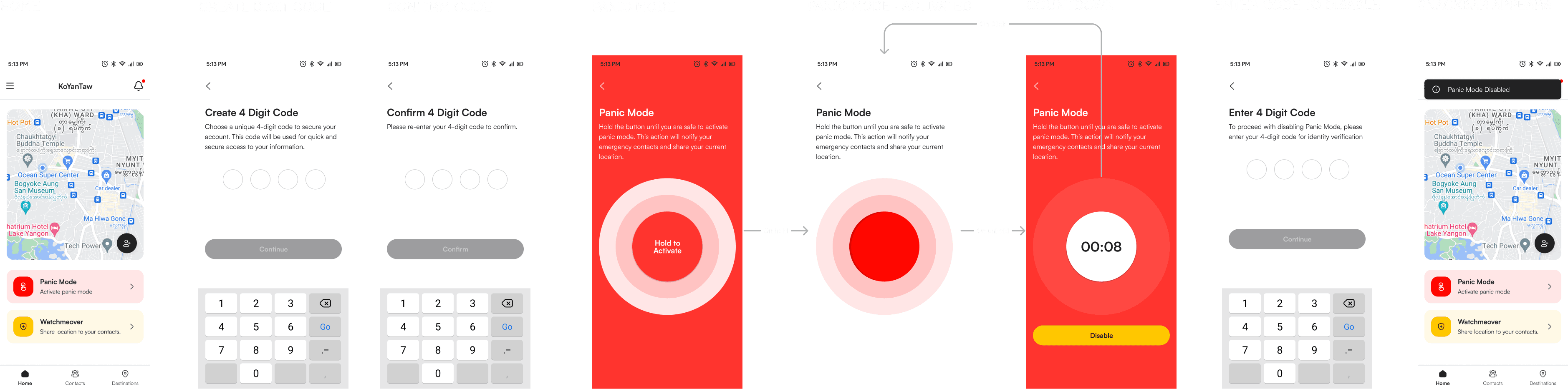
Information Architecture of the whole app
User Experience:
?
Participants found the button placement intuitive, but some were uncertain about the process of setting up and remembering their 4-digit code for deactivation.
User Feedback:
"
Users suggested a brief tutorial to explain how Panic Mode works, especially the need for the code.
Solution:
!
We implemented a quick onboarding tutorial for first-time users to guide them through Panic Mode setup.
Success Metrics
We measured task completion rates, perceived ease of use, and user satisfaction:
85%
Task Completion Rate
8.5/10
Ease of Use Rate
80%
Overall Statisfaction
Iteration & Refinement
Based on user feedback, we made the following improvements:
Redesigned the saved destination feature to be more visible and user-friendly.
Added a brief onboarding tutorial for Panic Mode to ensure better understanding of its functionality.
Outcome & Next Step
The first version, KoYanTaw 1.0, is now in development after final design iteration and testing. Our next steps involve further developing and refining the app based on user feedback during the development phase. Future iterations include features like route deviation alerts and automatic accident detection.